Tutorial | Visualizing Hospital Discharge Records in AZ Before and During Covid-19 with Latent Network Models in R
[Tutorial Network-Analysis R Visualization Project-Report Covid-19 Author: Jinhang Jiang
Adjunct Research Associate at University of Kansas, Business Analytics
A Code Demonstration of implementing a class of statistical models — LNMs and visualize the network data with the outputs in R

Introduction
In the book “Statistical Analysis of Network Data with R”, the authors talked about three families of statistical models that are applicable to the network data, which are Exponential Random Graph Models (ERGMs), Network Block Models (NBMs), and Latent Network Models (LNMs), respectively. In this blog, I am going to demonstrate how to fit an LNMs on network data in R and show you a potential usage (visualization) of the outputs with your project using a library called “eigenmodel” (Hoff, 2008). The methodology, codes, and findings covered in this blog are derived from an experimental project in one of my in-process research, Graph Analytics for Analyzing Unusual Patterns in U.S. Hospital Visits Discharge Records Reporting, with Prof. Srinivasan at the University of Kansas.
Latent Network Models (LNMs)
Like in many other machine learning and statistical modeling areas, the idea of latent variables has also been studied and incorporated into the network analysis with the class of latent network models (Kolaczyk et al., 2014). LNMs are designed to help people to study networks using variables that are unobserved but playing a significant role in the formation of the network. To learn more about its concepts, please refer to the book from p.102 to p.108.
Data
The Arizona Hospital Discharge Data Public Use Files (PUF) provided by the Bureau of Public Health Statistics,
Arizona Department of Health Services (AZDHS) was used as a partial data source in this project.
This is a similar dataset I used from Analyzing Disease Co-occurrence Using NetworkX, Gephi, and Node2Vec.
We also introduced ICD-10 data as a reference table to enrich the analysis.
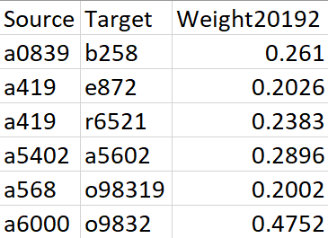
The original inputs are a weighted edgelist (generated from Electronic Health Records, ERHs) that represents the disease co-occurrence and a node attributes dataset, which contains the prevalence and category of each diagnosis. For a detailed description of data and calculation of edge weights, please refer to this paper.

Figure 1. Sample data for Edgelist
In this project, I want to compare the disease network of the hospital system in Arizona in three consecutive periods (before, beginning, and peak period of Covid-19) to monitor the changes over time.
And the three periods are the second half of 2019, the first half of 2020, and the second half of 2020.
There are 21 categories of diagnosis that exist in our dataset. We picked five of them (based on total prevalence) to observe and manually assigned different colors to them, and the unselected categories are all marked as ‘grey’. The selected categories with their paired colors: (metabolic diseases: burlywood1), (mental and behavioral disorders: goldenrod), (diseases of circulator system: aquamarine), (diseases of respiratory system: darkorchid1), and (other health services: red).

Figure 2. Sample Data for Node Attributes
Code
Step 1: Read data and generate a graph
#### Load Package #####
library(eigenmodel)
library(igraph)

#### Load data ####
set.seed(42)
edge1 <- read.csv("edge1.csv")
icd101 <- read.csv("icd101.csv")

#### Convert Graph ####
start.time <- Sys.time()
g1 <- graph_from_edgelist(as.matrix(edge1[,1:2]), directed = FALSE)
end.time <- Sys.time()
time.taken <- end.time - start.time
time.taken
Step 2: Add necessary node attributes
Those attributes will be used for plotting later.
#### Add attributes ####
###### re-index the icd10 files
icd101<-icd101[match(V(g1)$name,icd101[,1]),]

###### add prevalence
V(g1)$Prevalence<-icd101[,5]

##### add color
V(g1)$Color<-icd101$Color
Step 3: Generate adjacency matrix
The “eigenmodel” requires an adjacency matrix as input.
A <- get.adjacency(g1, sparse = FALSE)
Step 4: Fit an LNMs
To find out more about the parameters in this model, please check here (on page 4).
model1.1 <- eigenmodel_mcmc(A, R = 2)
Step 5: Extract the eigenvectors & other attributes
ULU_postmean is the posterior mean of the reduced-rank approximating matrix, and we use the first two columns of data as layout for plotting purposes, according to the tutorial in the book. The default matrix has 1000 dimensions, I tried different combinations of any two-dimensional latent spaces, and it turns out none of the combinations can outperform each other.
model1.1.lo <- eigen(model1.1$ULU_postmean)$vec[,1:2]
v.colors <- V(g1)$Color
v.size <- log(V(g1)$Prevalence)/1.3
Step 6: Compare the original plot and the plot with the latent variables
par(mfrow=c(1,2))
plot(simplify(simplify(g1)), vertex.color=v.colors,vertex.size = v.size, vertex.label=NA)
plot(g1, layout=model1.1.lo, vertex.color=v.colors,vertex.size = v.size, vertex.label=NA,margin=-.1)

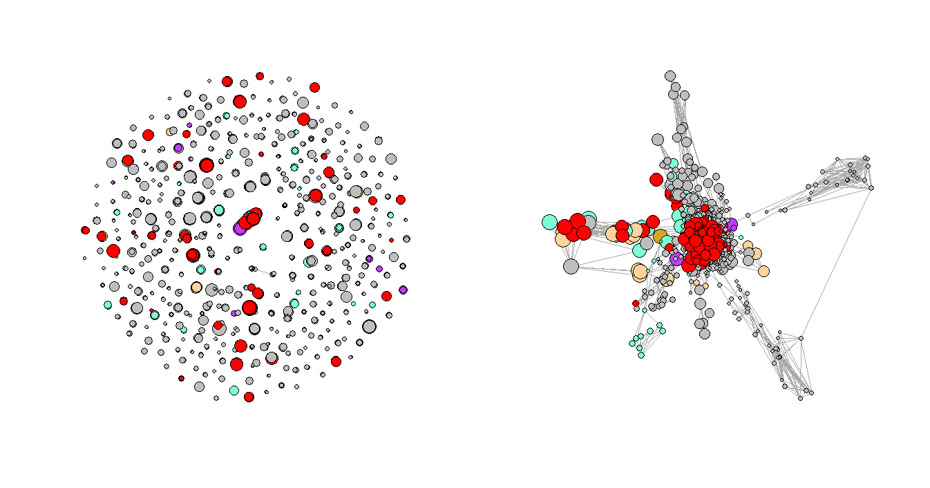
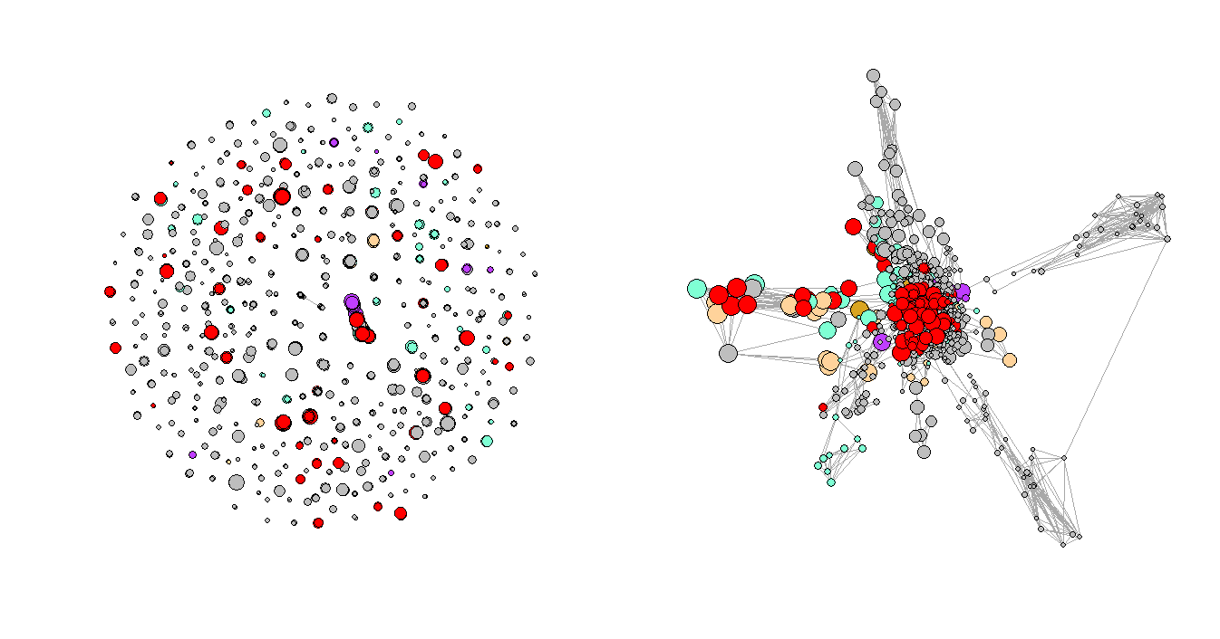
Figure 3. Regular Plot vs. LNMs-Based Plot
Step 7: Repeat steps 1–5 for the rest two periods and compares the results
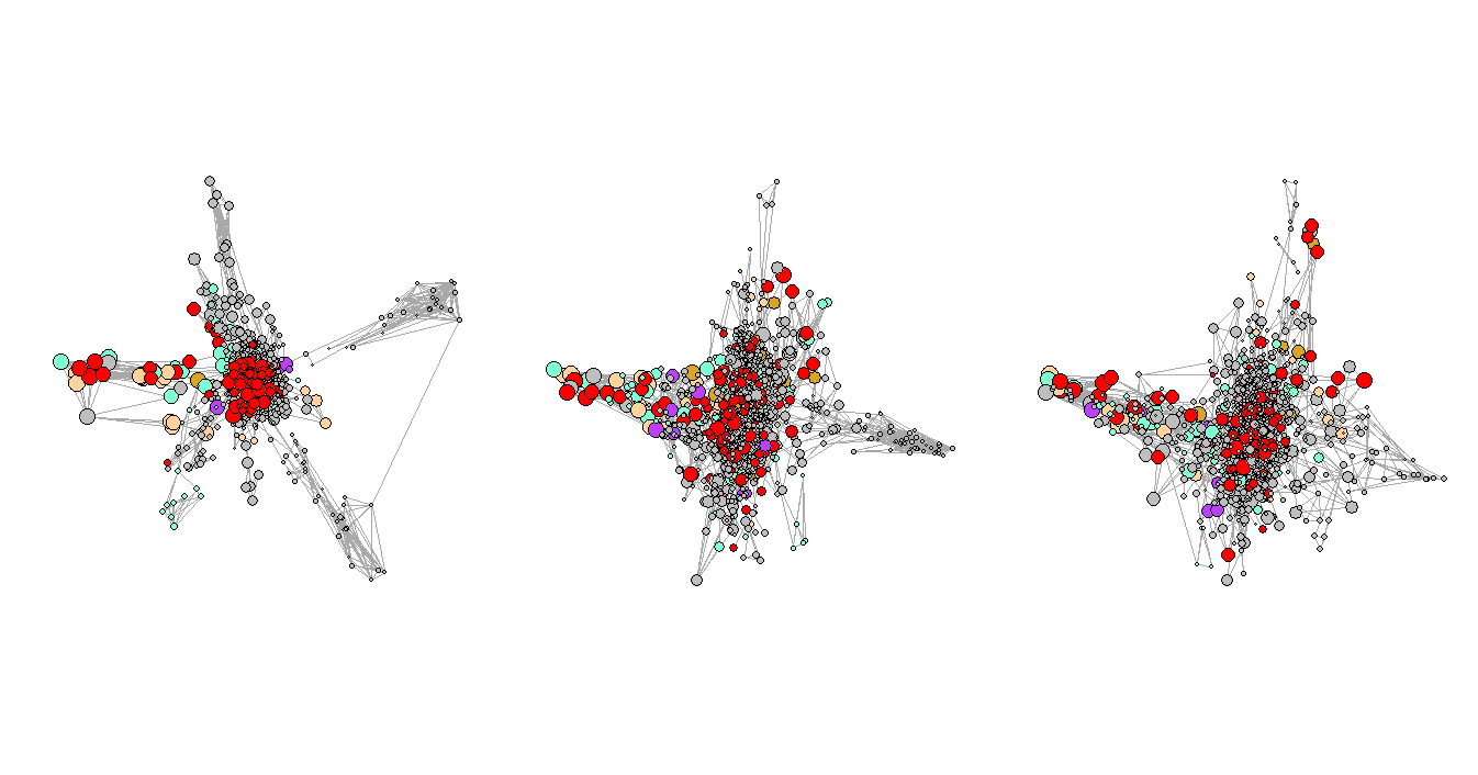
Figure 3 shows the network plots of the three selected consecutive periods. It is very clear that the first graph has a few very obvious clusters. However, as the Convid-19 began to spread, some of the clusters had disappeared while a few new clusters formed in the second and third periods, and the graphs are not as organized as the first one, which represents the normal period or the period before Covid-19. One of the explanations for the formation of the new clusters could be that more unusual complications were reported during that time.

Figure 4. Network Plots with Eigenvalues Over Time
Goodness of Fit
One of the ways mentioned in the book to evaluate the goodness of fit is to compare the posterior means of the elements in the L_postsamp of the fitted model. If one of the eigenvalues clearly dominates the other one (e.g., 1.04 and 0.26), it means the network is not well explained by the current variables/structure. On the other hand, if the eigenvalues are comparable in their magnitude (e.g., 0.59 and 0.31), it means the model fitted well and decidedly less structure left to be captured by the latent variables.
Take our first model and third model as examples:
> apply(model1.1$L_postsamp, 2, mean)
[1] 0.2227712 0.1773729

> apply(model3.1$L_postsamp, 2, mean)
[1]  0.23991516 -0.01474853
We can tell from the outputs that the eigenvalues of the first model are very close, which is a pretty positive sign for the goodness of fit for the first model. However, the eigenvalues of the third model (the data from the second half of 2020) are not as comparable as it was in the first model. This change shows that as the Covid-19 intensified in Arizona, there were unobserved variables having impacts on the whole hospital system in the state but the original dataset did not have enough information for the LNMs to infer.
Discussion
It is not hard to tell by the name of the latent network models (LNMs) that the outputs (latent variables) of the models are very hard to interpret and be explained by human languages. The idea of latent variables has been studied and developed in the area of statistical learning since the nineteen fifties (Lazarsfeld, 1955), yet it is less studied and applied in network analysis. In this post, built upon Chapter 6.4 in Statistical Analysis of Network Data with R, I demonstrate the implementation and one potential usage of it with the “eigenmodel” library in R. The outcome of the project in this blog should help you generalize its application to similar projects and also offers you the very first step to studying more usages of this model.
I also found that the “eigenmodel” also had some limitations during my experiments and I summarized them here. First, since it is using the Markov chain Monte Carlo (MCMC) methods, the sampling process will significantly slow down the fitting process. Second, it has a hard time dealing with a large set of network data, and sometimes it even will not converge.
Conclusion
In this blog, I talked about the basic concepts, implementation, one potential usage, and the goodness of fit and limitations of the Latent Network Models in R. It can help us easily observe the changing patterns of the hospital systems in Arizona. Implementing this method could help convey valuable insights through visualizations to non-technical people. Last but not least, the idea of this project should be generalizable to other social network projects as well.
Related Reading
Analyzing Disease Co-occurrence Using NetworkX, Gephi, and Node2Vec
Visualize High-Dimensional Network Data with 3D 360-Degree-Animated Scatter Plot
Network Analysis with R: Manipulating Network Data
NetworkX: Code Demo for Manipulating Subgraphs
What Is Embedding and What Can You Do with It
